I want to talk about my absolute favourite PS1 case - and it is, in the best possible way, a complete disaster. The game is Epidemic, and what happened to its packaging is a perfect record of one of the most significant transitions in PlayStation history.
1996 - Before the Black Label
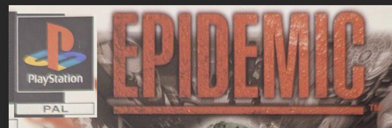
For the first couple of years, PAL PlayStation games were released without any officially licensed product hologram or the branding we now associate with the platform. The only requirement was the PlayStation logo in the top-left corner of the front cover, with a small box beneath it stating the region - “PAL” for us, “NTSC-J” for Japan, “NTSC-U/C” for North America.
Sony’s copy protection relied on a reasonably sophisticated system built into the hardware itself, designed to reject unofficial discs. For a while, it worked.
Then came the mod chip.
Through 1996, small modification chips began appearing in the market that allowed players to run copied CDs on original hardware. By the end of the year, cheap chips were flooding European markets, and Sony found itself needing to respond. The copy protection that had felt robust was being bypassed by something you could fit under a fingernail.
The Black Label
Sony’s answer, rolled out through early to mid 1997, was a new mandatory design requirement for all PlayStation game releases.
The revised design introduced a black band along the bottom of the front cover, taking up roughly 20% of the available space. On the right side of this band sat the official PlayStation logo text. On the left, a deliberate gap was left - this was where the hologram would be physically applied to the front of the case.
For a game published by Sony themselves, the final count was five logos on the front cover alone: the original colour PlayStation logo top-left, the Sony Computer Entertainment publisher logo bottom-right, the PlayStation text in the black label, and the two logos encoded within the hologram itself.
It was a significant visual change, and publishers had to adapt their artwork to accommodate it.
Manuals
Worth noting as a separate point: game manuals also received the black label treatment, but without a hologram. This meant the PlayStation logo text on manuals was centred rather than right-aligned - because there was no hologram to leave room for.
This distinction matters more than you might think. On an original black label front cover, the PlayStation logo sits to the right, with the hologram sitting to its left and partially obscuring it. If you’re hunting in the second-hand market and come across a copy where the logo text is centred and fully visible, there’s a very good chance the front artwork sleeve is missing and you’re looking at a bare manual. It’s a useful thing to know.
Epidemic
Some games were further along in production when Sony issued the new mandate than others, and the evidence is written across their cases. Ridge Racer Revolution, for instance, was already in circulation before the hologram requirement landed - later print runs added the hologram between the Namco and SCE logos, but no black label design appeared on any release of the game until it was reissued as a Platinum title.
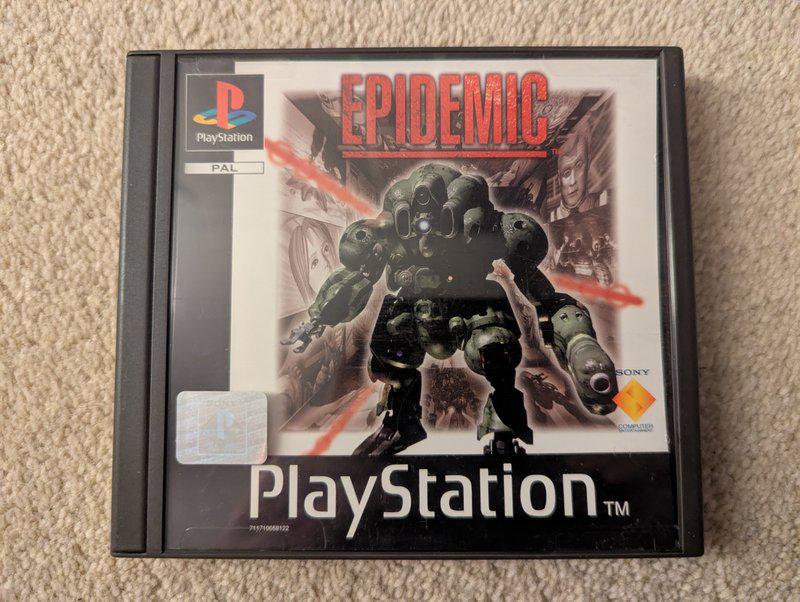
Epidemic appears to have been caught at exactly the wrong moment. The result is, frankly, a mess - and I love it.
The Artwork
The first sign that something went wrong is visible the moment you look at the front cover. The main artwork features a drawn mech - the machine you control in the game - set against a collage of FMV footage. What immediately stands out are the black borders running along the left side and bottom of the print.
At a glance, this isn’t unusual. Pandemonium (games/pandemonium/) and Resident Evil (games/resident-evil/), both released a few months earlier, have similar dark borders. But look more carefully and the difference becomes apparent.
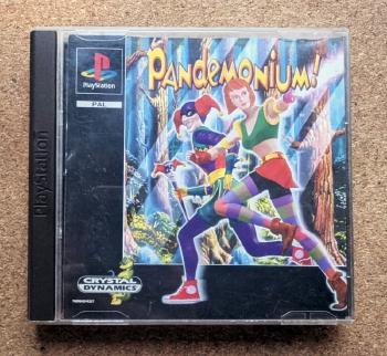
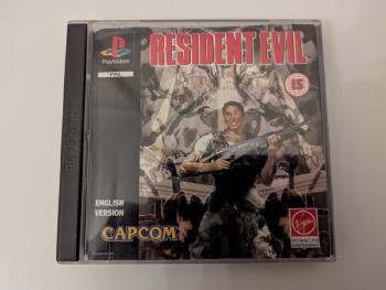
Pandemonium’s artwork was clearly designed around its border - the character Nikki spills outward over the edge, deliberately breaking the frame. The border is also consistent in width on all sides. Resident Evil’s border runs only along the left side, and the artwork fits neatly within it; the Capcom logo sits precisely at the boundary.
Epidemic’s borders are different proportions on the left versus the bottom. There’s no sense that the artwork was designed with them in mind. And there’s a specific reason for that.
Scale, Not Slice
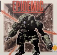
The original artwork for Epidemic was designed to fill the entire front cover - no borders, edge to edge. You can tell because the background tableau of FMV imagery is proportioned exactly to match the full case dimensions, with equal bleed on all four sides. The PlayStation logo, when the original artwork is viewed at full scale, aligns naturally with the large Epidemic title text.
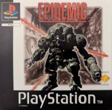
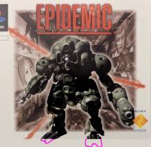
What happened is that the artwork was scaled down to create the black label space at the bottom - but the reduction wasn’t uniform. The mech’s feet were already close to the bottom of the frame, and scaling to accommodate the new border meant the left-side border ended up narrower than the bottom one. The artwork wasn’t re-composed; it was compressed, and the proportions show it.
The Hologram Squeeze
The mess doesn’t stop there. To find a truly original copy of this game, you’re looking for one where the hologram is in the wrong place - because it had to be.
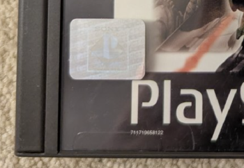
Recall how the black label was supposed to work: the PlayStation logo text sits to the right, leaving clear space on the left for the hologram to be applied. This meant the logo had to be right-aligned in the design.
On Epidemic’s front cover, the PlayStation logo is centred. Almost certainly the result of a rushed job to meet a deadline, the print went out without the right-aligned text that the hologram required. When the team responsible for applying holograms received the printed cases, they had no space in the black label where the hologram was supposed to go.
Their solution was to place it above the black label entirely - right at the bottom-left of the main artwork, where it cuts into the image and typically clips the top of the “P” in PlayStation. Every hologrammed copy of this game has the sticker sitting somewhere it was never intended to go.
Wrapup
What we’re left with is a jewel case that accidentally documents an entire chapter of PlayStation history. The scaled-down artwork, the proportional mismatch, the centred logo, the misplaced hologram - each one is a direct consequence of a mandate arriving mid-production, and none of it was caught before the cases shipped.
No other PAL PlayStation release packs so much history into its physical design. It’s my favourite, and I wouldn’t change a thing.